✚ Visualization Tools, Datasets, and Resources – March 2025 Roundup
Updated: 2025-03-27 18:30:08
 Here are tools you can use, data to play with, and resources to learn from that flew across my desk in March.Tags: roundup
 Here are tools you can use, data to play with, and resources to learn from that flew across my desk in March.Tags: roundup
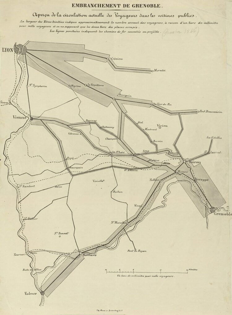
 Charles-Joseph Minard was born on March 27, 1781. Most who know the name…Tags: Charles-Joseph Minard
 Any Map Puzzle by Ahmad Barclay lets you search for a location and…Tags: Ahmad Barclay, OpenStreetMap, puzzle
 Simon Rogers Data journalism and other curiosities Search Search : for Go Home About Subscribe Contact Home About Archives Contacts Speaking interviews Training Animations Facts are Sacred On guardian.co.uk Subscribe to RSS you're reading . Data journalism Data visualisation podcast Data+Love+why it matters in the age of AI Posted by Simon Rogers March 13, 2025 Leave a comment Filed Under data data journalism dataviz journalism open data One of my favourite data podcasts is Data+Love , hosted by the brilliant Zach Bowders We chatted for the latest episode about why people should care about data , how to make it human and why it matters . Check it out Share : this Click to email a link to a friend Opens in new window Click to share on Twitter Opens in new window Click to share on Facebook